0%

Making charts with python matplotlib

About matplotlib

Matplotlib is a python plotting library which can help generate plots, and charts.

Installation

Install python3 matplotlib on my Ubuntu 16.04 box

1
$ sudo apt install python3-matplotlib

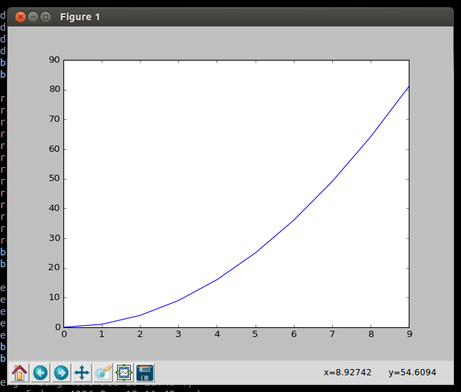
Creating a simple chart in python shell

1
2
3
4
5
6
7
8
9
10
11
12
$ python3
Python 3.5.2 (default, Nov 23 2017, 16:37:01)
[GCC 5.4.0 20160609] on linux
Type "help", "copyright", "credits" or "license" for more information.
>>> import matplotlib.pyplot as plt
>>> plt
<module 'matplotlib.pyplot' from '/usr/lib/python3/dist-packages/matplotlib/pyplot.py'>
>>> x = range(10) # create X coordinate data
>>> y = [ i*i for i in x ] # create Y coordinate data with square of data on X.
>>> plt.plot(x, y)
[<matplotlib.lines.Line2D object at 0x7f4f7d4433c8>]
>>> plt.show()

Then I got the chart

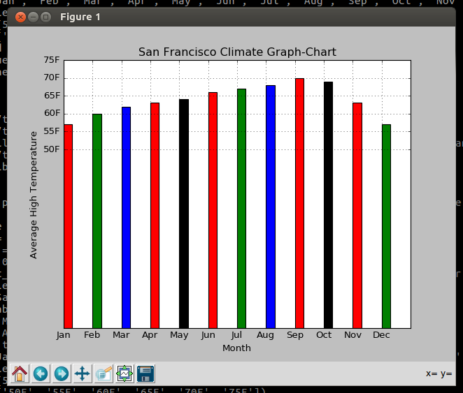
Creating a bar chart

Next I wrote a script to generate a bar chart of the average monthly high temperature of San Francisco.

1
2
3
4
5
6
7
8
9
10
11
12
13
14
15
16
17
18
19
20
21
22
23
import matplotlib.pyplot as plt
def main():
print('This program will generate a bar chart of the monthly average high temperature of San Francisco')
# Create the list of X and Y cordinate data
left_edges = [ i for i in range(12)]
temperature = [57, 60, 62, 63, 64, 66, 67, 68, 70, 69, 63, 57]
bar_width = 0.3
plt.bar(left_edges, temperature, bar_width, color=('r','g','b','r','k','r','g','b','r','k','r','g'))
# Add a title
plt.title('San Francisco Climate Graph-Chart')
# Add the label to the axes
plt.xlabel('Month')
plt.ylabel('Average High Temperature')
# Customize the tick marks
months = ['Jan', 'Feb', 'Mar', 'Apr', 'May', 'Jun', 'Jul', 'Aug', 'Sep', 'Oct', 'Nov', 'Dec']
plt.xticks(left_edges, months)
plt.yticks([50, 55, 60, 65, 70, 75], ['50F', '55F', '60F', '65F', '70F', '75F'])
# Add a grid
plt.grid(True)
# Display the bar chart graph
plt.show()

main()

Then I got the bar chart

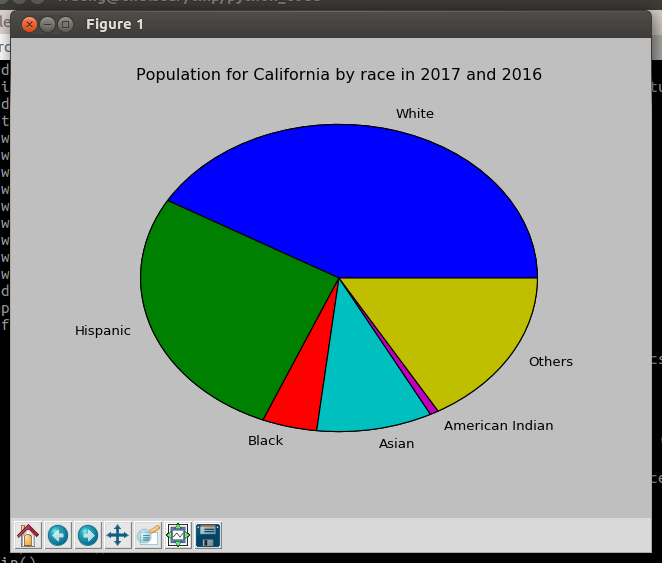
Creating a pie chart

This script I wrote generates a pie chart of the Population for California by race in 2017 and 2016

1
2
3
4
5
6
7
8
9
10
11
12
13
14
15
import matplotlib.pyplot as plt
def main():
print('This program will generate a pie chart of Population for California by race in 2017 and 2016')
values = [21454, 14014, 2299, 4861, 363, 8600]
plt.pie(values)
slice_label = ['White', 'Hispanic', 'Black', 'Asian', 'American Indian', 'Others']
# Add a title
plt.title('Population for California by race in 2017 and 2016')
# Add the label to the axes
plt.pie(values, labels=slice_label)
# save the chart image
plt.savefig('pie_chart.png')
# Display the pie chart graph
plt.show()
main()

The pie chart I got

Save the chart to a image file

Just use the savefig() method.

1
plt.savefig('bar_chart.png')